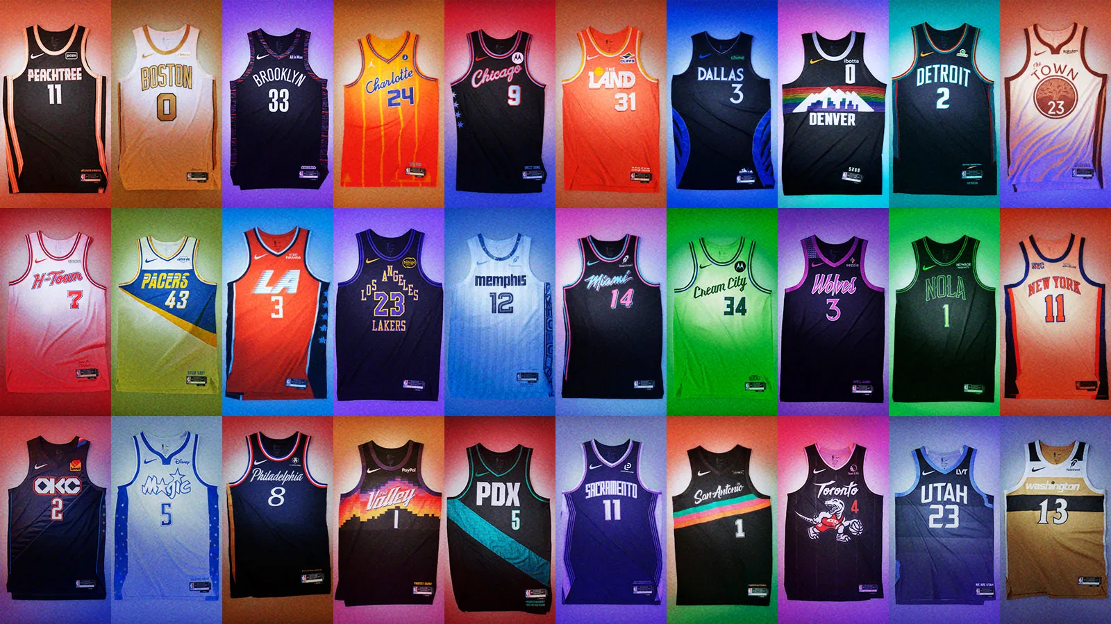
All 30 2025-26 NBA City Edition jerseys, ranked
Kyrie Irving once said that “basketball is not a game; it’s an art form.”
This belief obviously shows how the players work on the court, but it goes even deeper, because NBA players have a role to play. This refers to the clothes they wear on the field. The NBA has officially announced City Edition jerseys for all 30 teams.
These alternate uniforms should stand out compared to the everyday jerseys each team wears, while also reflecting the roots of the cities each team plays in. So who hit the mark with their City Edition jerseys this year and which franchises were missing out?
Note: Each NBA City Edition jersey can be located here.
30. New York Knicks
If the regular New York Knicks jerseys were placed side by side with their City Edition jerseys, the average fan probably wouldn’t be able to decipher which is which. It defeats the purpose of the whole idea.
29. Milwaukee Bucks
The Milwaukee Bucks City Edition jerseys are too simple and something fans have seen before. These jerseys originally debuted in 2019-20.
28. Utah Jazz
The Utah Jazz have historically had some of the best jerseys in the NBA. They missed the mark this year. The supposed to be iconic stripe pattern is almost unrecognizable as each layer is dark blue. Utah needs to give fans the mountains and the colors, as they have done in the past.
27. Houston Rockets
The Houston Rockets’ “H-Town” jerseys are another example of a jersey that didn’t need repeating. The H-Town and number font are cool, and that’s about it.
26. Detroit Pistons
The Detroit Pistons could have done a lot more with their City Edition jerseys. These jerseys blend past and present quite well, and aren’t ugly, but they leave something to be desired, given what fans have gotten from Detroit before.
25. New Orleans Pelicans
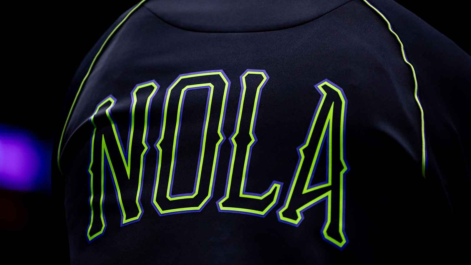
The idea behind the New Orleans Pelicans City Edition jersey is that magic and mystery meet the lighting of New Orleans nightlife. These jerseys show that, but it could have been a little more. Despite this, the “NOLA” print gives off a haunted atmosphere.
24. Los Angeles Lakers
“Los Angeles Lakers” written in a pyramid way is cool. Other than that, there’s not much to these City Edition jerseys, which is a shame because there’s a lot of potential with the purple and gold.
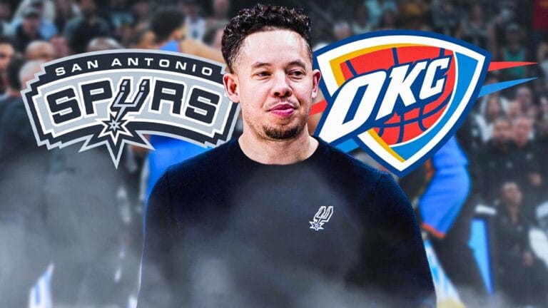
23. Oklahoma City Thunder
The Oklahoma City Thunder are the defending champions and have looked nearly unbeatable so far during the 2025-26 season. They could have looked a little better while dominating, as their City Edition kits are pretty mediocre. The jersey is split diagonally into two different colors, which is unique, but there isn’t enough contrast to notice at first glance, so the best part of these jerseys might not be something you can see on screen with the naked eye.
22. Philadelphia 76ers
The idea behind the Philadelphia 76ers City Edition jerseys that represent the crack in the Liberty Bell is cool. However, it plays a little better in theory than in practice.
21. Minnesota Timberwolves
The Minnesota Timberwolves’ Prince-inspired purple jerseys are super polarizing. Some fans love them and some hate them, but they end up in the middle to late part of this ranking.
20. Los Angeles Clippers
The history of the Los Angeles Clippers goes back to Buffalo, New York and San Diego, California, before the team found a permanent home in LA. The City Edition team jerseys take fans on a historic tour of the team’s history.
19. Atlanta Hawks
The Atlanta Hawks are re-using the Peachtree City Edition jerseys. The peach band is the best part of the jerseys and really stands out against the base black color.
18. Portland Trail Blazers
The huge gray stripe, meant to represent the PDKS airport runway, really catches the eye when it comes to Portland Trail Blazers jerseys. Not much else to write about, but the bluish streak certainly jumps out.
17. Brooklyn Nets
The Brooklyn Nets are in the mix, along with a handful of jerseys to come, teams that have either rehashed a previous jersey or used a design eerily similar to the City Edition of yesteryear. While these are great jerseys, they were better in the first place. Everyone loves the Biggie Smalls camo print, but it’s been done a bit in that situation which leads to Brooklyn jerseys ranking in the middle of this list.
16. San Antonio Spurs
The Fiesta colorway of the San Antonio Spurs is a classic. The City Edition 2025-26 kits aren’t the most colorful or colorful in the history of the theme, but they combine the idea of fiesta with the iconic black quite well.
15. Orlando Magic
Orlando Magic jerseys and a star-studded space theme go together like two peas in a pod. Magic was smart to use white as a base rather than blue or black as fans have seen before.
14. Phoenix Suns
The Phoenix Suns “Valley” jerseys are back. The checkered skyline pattern was a huge hit when these jerseys first debuted, and the design still works quite well.
13. Chicago Bulls
Chicago Bulls jerseys are inspired by the city’s flag. The pale blue interior of the red line on the number/name plate provides a great contrast to the predominantly black jerseys. Of course, the icons are also the four stars on the side of the jersey.
12. Toronto Raptors
Toronto Raptors throwback jerseys are among the best in NBA history. This year, the team perfectly combines their old jerseys with a modern aesthetic. The new school Dino jerseys aren’t quite as great as they were in the 90s, but they’re still pretty good.
11. Denver Nuggets
City Edition means the horizon for the Denver Nuggets. Of all the skyline color combinations the team has used, the black base is perhaps the biggest fan favorite. Denver returns this year for the 2019-20 iteration of the jerseys. They’re still pleasing to the eye, but the Nuggets have enough color options that it would be nice to see them try something different while still using the horizon concept.
10. Dallas Mavericks
The The Dallas Mavericks just fired Nick Harrisonin large part because fans weren’t happy about the former general manager’s decision to shop Luka Dončić. Still, they have some pretty sweet jerseys to look forward to seeing in action. Navy blue wings spread across the sides of the jerseys to represent Dallas’ nickname: Pegasus City.
9. Cleveland Cavaliers
The Cleveland Cavaliers were one of the teams that defied the status quo and instead swung for the fences. These jerseys use a vibrant orange color that represents Cleveland’s sunsets and sunrises. It may not be the Cavaliers’ usual colorway, but the gamble paid off with one of the more memorable jerseys from this year’s City Edition lineup.
8. Sacramento Kings
“The Beam” has taken over Sacramento sports in recent years, and now the Kings are showcasing that lighting on their City Edition jerseys. The pinkish white finish contrasts perfectly with the dark purple base.
7. Memphis Grizzlies
The Memphis Grizzlies are one of the teams that consistently develops the City Edition concept. The white jersey with light blue vertical stripes isn’t too crazy, but the simplicity works incredibly well with the side stripe that pops and is filled with different shapes and sizes. The Grizzlies jerseys are inspired by the music culture of Tennessee.
6. Golden State Warriors
The Golden State Warriors City Edition jerseys use soft colors, including cream, dark brown and faint yellow. The jerseys almost look like they are from a black and white movie. Oakland Oak Tree works perfectly with this color combination.
5. Boston Celtics
Too often, the Boston Celtics use boring and bland jerseys that make it look like the team is stuck in the glory days of the 60s and 80s, when Bill Russell or Larry Bird won championships. That’s why it was a breath of fresh air that the team took a few risks with this year’s jerseys. The white with gold was a big change that really stands out. The jerseys are still able to pay respect to the team’s history, as the gold is supposed to represent Boston’s championship run.
4. Miami Heat
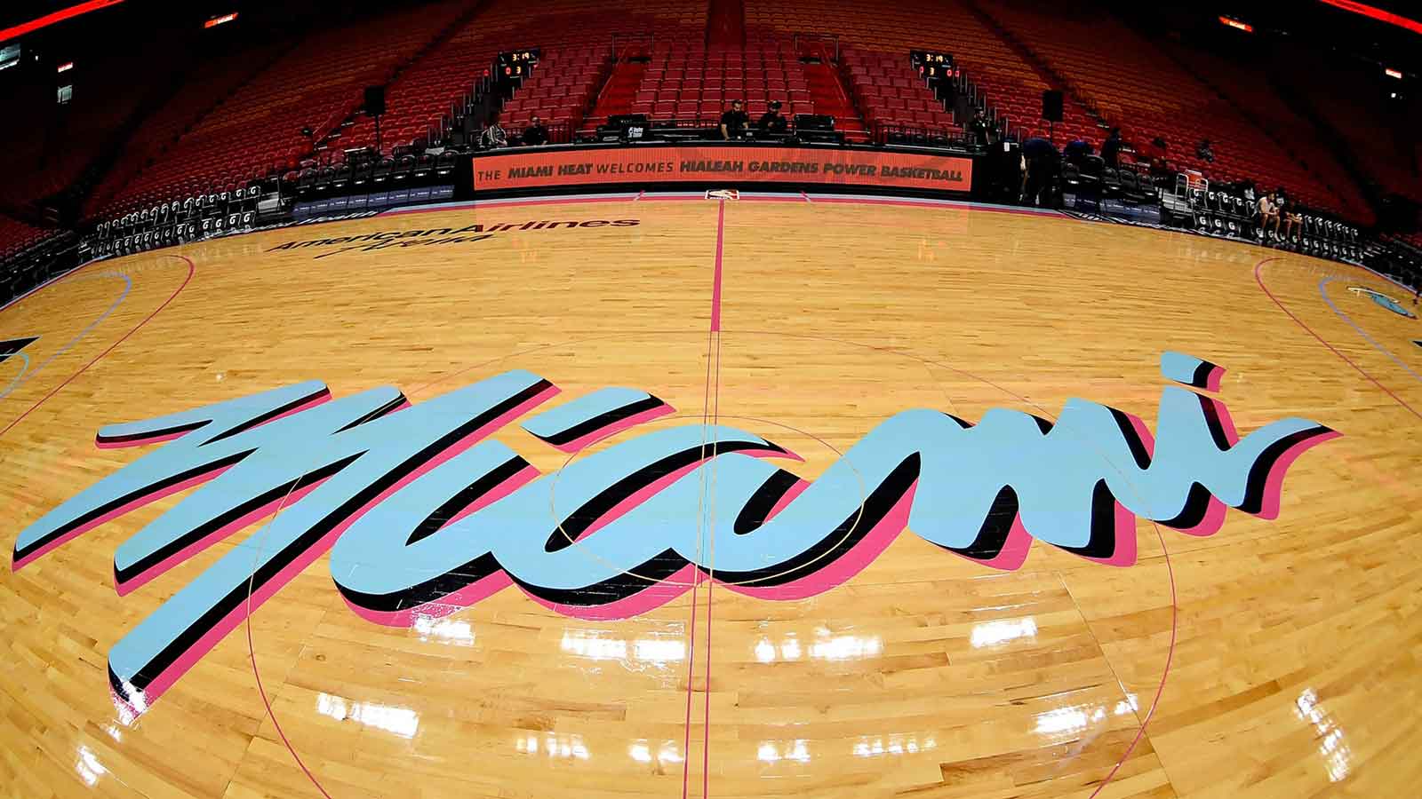
The Miami Heat previously used the Vice City colors of black, pink and baby blue. The lack of originality is the only thing holding the Heat back in these rankings, but no one is complaining about the Heat bringing back their original Vice Nights jerseys. These jerseys are simply some of the best in NBA history. The three-dimensional lettering is particularly iconic, and the pink on the jersey is something that no one forgets.
3. Charlotte Hornets
City Edition jerseys are all about taking risks, and the Charlotte Hornets certainly took a gamble with bright, vibrant colors that aren’t even close to their usual colorway, which is already a league favorite. It worked, too, as the orange backing that fades to more yellow makes Charlotte’s jerseys one of the standouts of the year. The team is always great with stripes, and it showed again here.
2. Indiana Pacers
The Indiana Pacers jerseys date back to the early days of the NBA and are awesome. Blue, yellow and white all look old school, but the asymmetrical way they are displayed across the jersey brings a touch of modernism. The Pacers nameplate could be reminiscent of the team’s namesake, as the team was based on the pacer cars in NASCAR and the Indianapolis 500.
1. Washington Wizards
The Washington Wizards City Edition jerseys are the perfect blend of a unique colorway fans aren’t used to and nostalgic throwbacks. Golden brown is not a color fans see often, so these jerseys will really pop on the field. They also take fans back to a simpler time when Gilbert Arenas and Antawn Jamison were doing their thing. To take it a step further, the double stripe pattern across the chest is reminiscent of the Washington Bullets jerseys of the 70s and 80s.
2025-11-11 23:32:00